Welcome to Part 9 of the COVIDiary project! If you’re just joining us or missed a post, here’s what we’ve done so far:
- Part 1: Project Introduction
- Part 2: Initial Setup
- Part 3: Building the Database
- Part 4: Frontend Setup
- Part 4.5: Database Fixes
- Part 5: Backend Routing
- Part 6: Formatting Data
- Part 7: A Little More Action
- Part 8: Make the Connection
This week, we’re stepping away from the keyboard. Though the work we’re about to do is absolutely necessary for our sanity, it won’t involve a single line of code. In fact, if you want, you can complete all of today’s work with a pencil and paper!
What are we doing? We’re planning our website layout. We’ll build a sitemap to get a feel for what pages we actually need. Then, we’ll create wireframes to rough out our design.
Why Step Back?
I’ve made a few websites now, and, due to project deadlines, they were largely chaotic, head-long rushes to completion. It was both stressful and terribly inefficient. As a writer, I never worked without an outline. Why would I design an application without creating a plan?
By pausing to get the broad strokes of our application on paper, we’ll free up time, later on, to hone and fine-tune our work. We’ll be able to visualize how a user might interact with our app, and we can use that to inform our design choices. We will see, at a glance, which React components will be used over and over.
Drafting the Sitemap
Put simply, a sitemap is a list of pages on a website. There are different types of sitemaps for different uses, but today we’re just building an outline for planning purposes. From a development perspective, this is a crucial step.
When designing your sitemap, your user should be at the forefront of your mind. What are the most important features to the user? How many clicks do they need to make to get from one page to the next? Which links should always be available? Which pages should be protected with a login?
You can do this all on paper, but I used diagrams.net, which is useful for all sorts of diagrams, not just a sitemap. I also highly recommend it when designing your database structure.
Let’s get started.
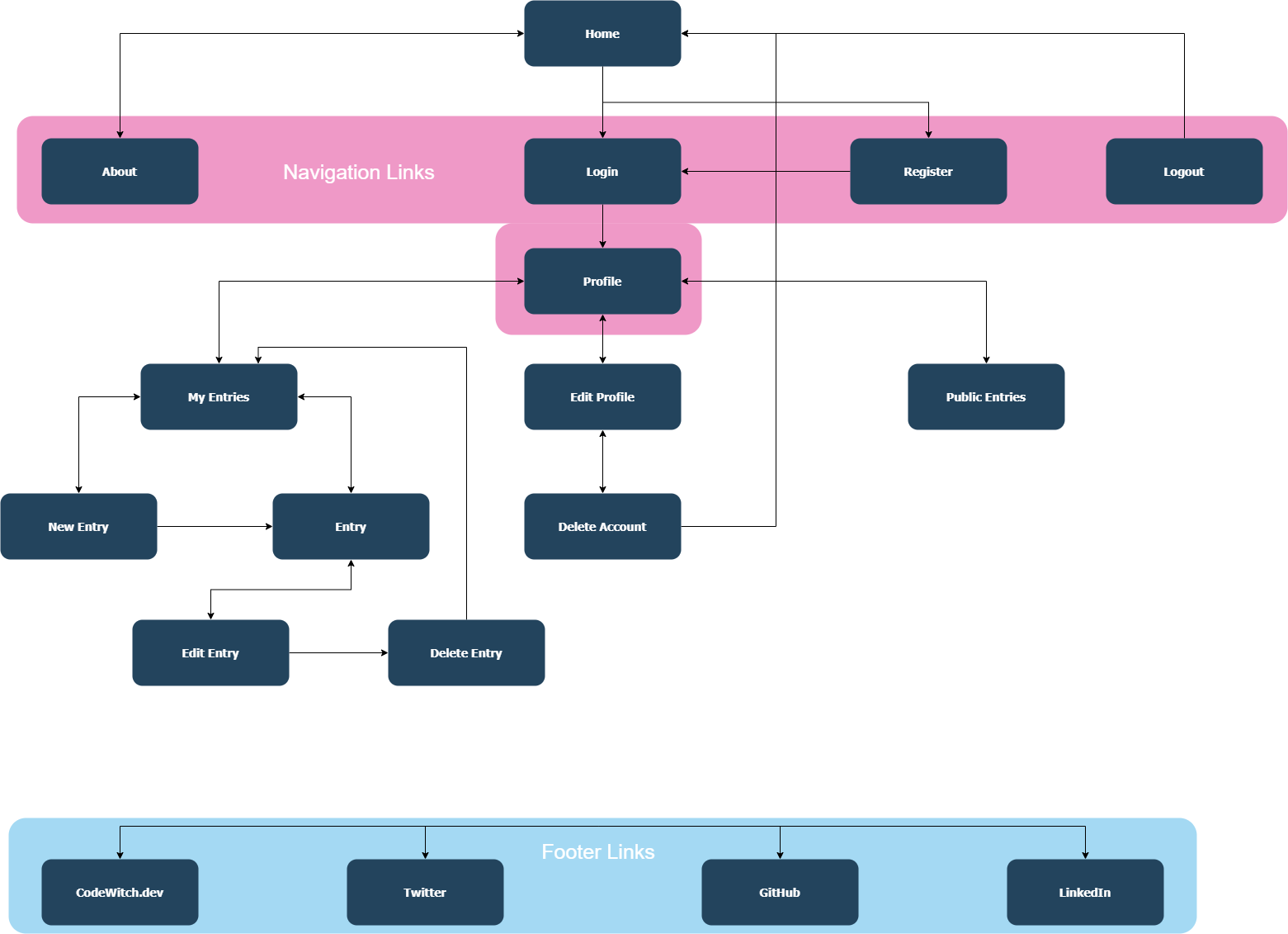
First, I created a box for each page I knew I wanted in my application. Then, I rearranged the boxes and connected them with arrows that indicate the user flow. Finally, I grouped the navigation and footer links together, as they will appear on every page.

Drawing the Wireframes
A wireframe is a very basic sketch of a webpage. They are like a builder’s set of blueprints. With a wireframe, developers are able to visualize the placement of different elements on a page.
In many professional settings, a designer draws up the wireframes, and the developer writes the code that brings the plans to life. On personal projects or for smaller companies, however, we won’t always have that luxury.
Having never actually made official wireframes myself, I read a few articles before I began. There are tons of great resources out there, but it seemed the bottom line with wireframes is to keep it simple.
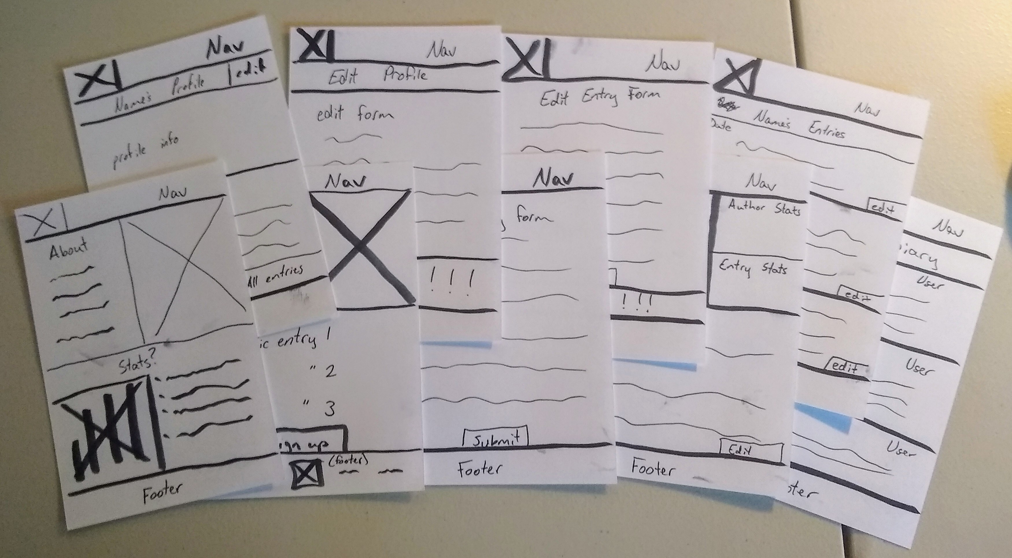
To sketch my wireframes, I grabbed a stack of 3x5 index cards and a marker. When constructing wireframes, many designers use a felt-tipped marker to prevent them from getting too detailed. I used one index card per page. I drew the wireframe on the blank side, and I used the lined side for any quick notes.

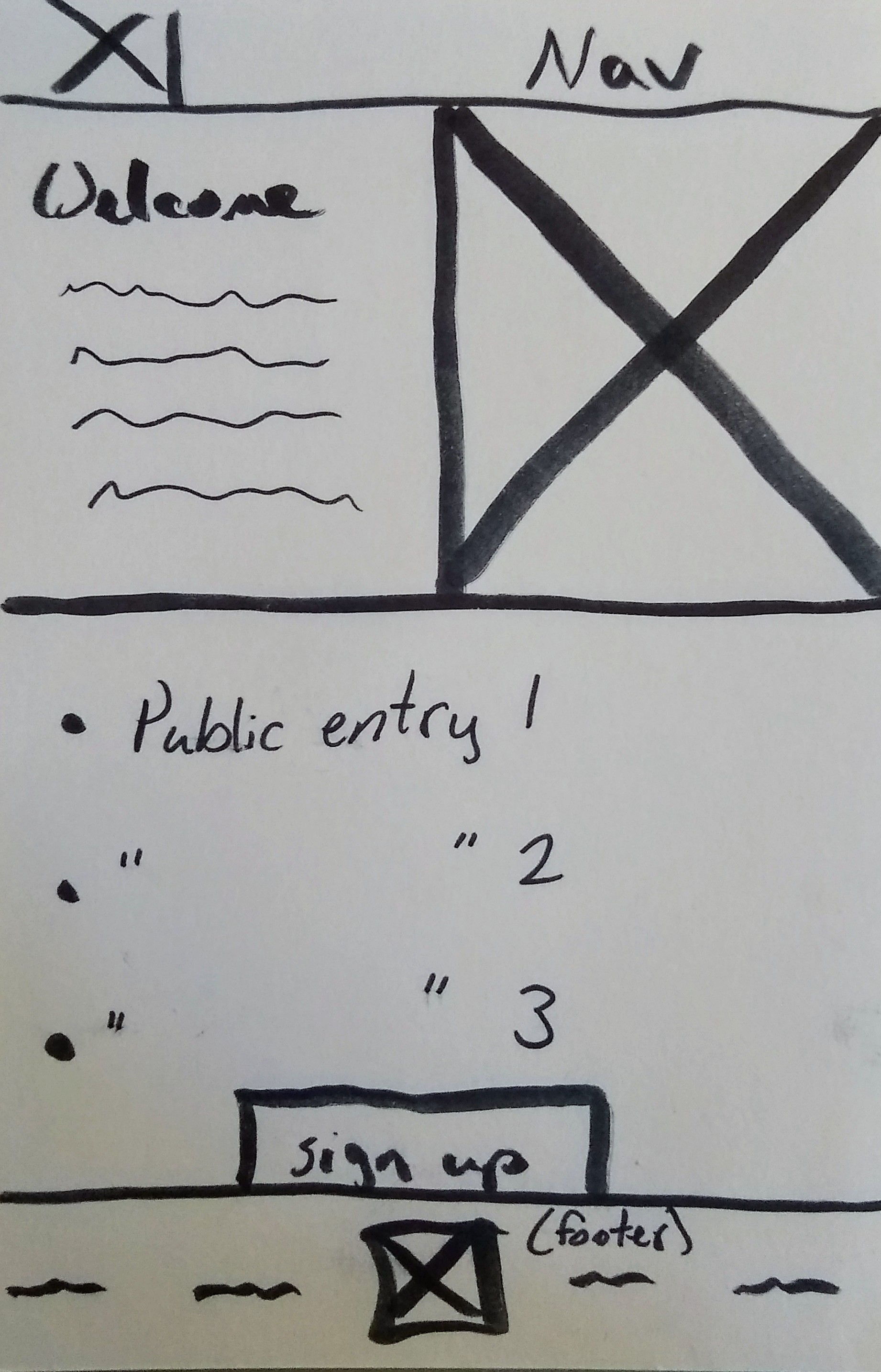
As you can see, the design for my home page is very simple. At a glance, I can see I want a few images (indicated by the boxed-x placeholder), a brief page intro, and a preview of three recent entries. I also know I want a horizontal navigation bar, and I have a general feel for what the footer should look like. After completing the rest of the wireframes, I can also tell which components will be used over and over, like the diary entries, for example.
If I were collaborating with another developer, now would be a great time to seek feedback and compare notes. We could then iterate on our initial ideas until we have a set of designs we’re both happy with.

Remember, these wireframes are your outline. They are loose sketches, and you aren’t married to any specific idea. Don’t stress too much over your designs at first. Just get some thoughts on paper. We’ll refine our ideas once we start coding.
Coming Up
Now that we’ve got a general idea of the pages and components we need to build, we’re ready to build our first React components!